
- Visual Branding
- Merchandise & Promotional Design
Wing-Tsun Akademie Berlin
About the project
Forging a strong visual identity for a martial arts school
THE
CHALLENGE
The project presented a few notable challenges. Firstly, I needed to capture the essence of the martial arts school's core values and translate them into a visually appealing brand identity. Secondly, it was crucial to create a design system that resonated with both students and teachers, reflecting their shared passion and dedication. Lastly, I had to develop a cohesive design approach that could be applied across various merchandise items while still allowing for individual uniqueness.
MY
APPROACH
To begin the project, I conducted thorough research to gain a deep understanding of the martial arts school's history, philosophy, and ethos. This research phase allowed me to align my design concepts with the client's goals and target audience preferences. Collaboration with the client played a vital role, as I engaged closely with them to gather insights, preferences, and specific requirements. This collaborative effort ensured that the final design would accurately represent the school's identity and values.
THE
SOLUTION
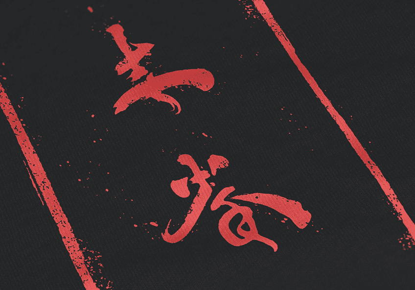
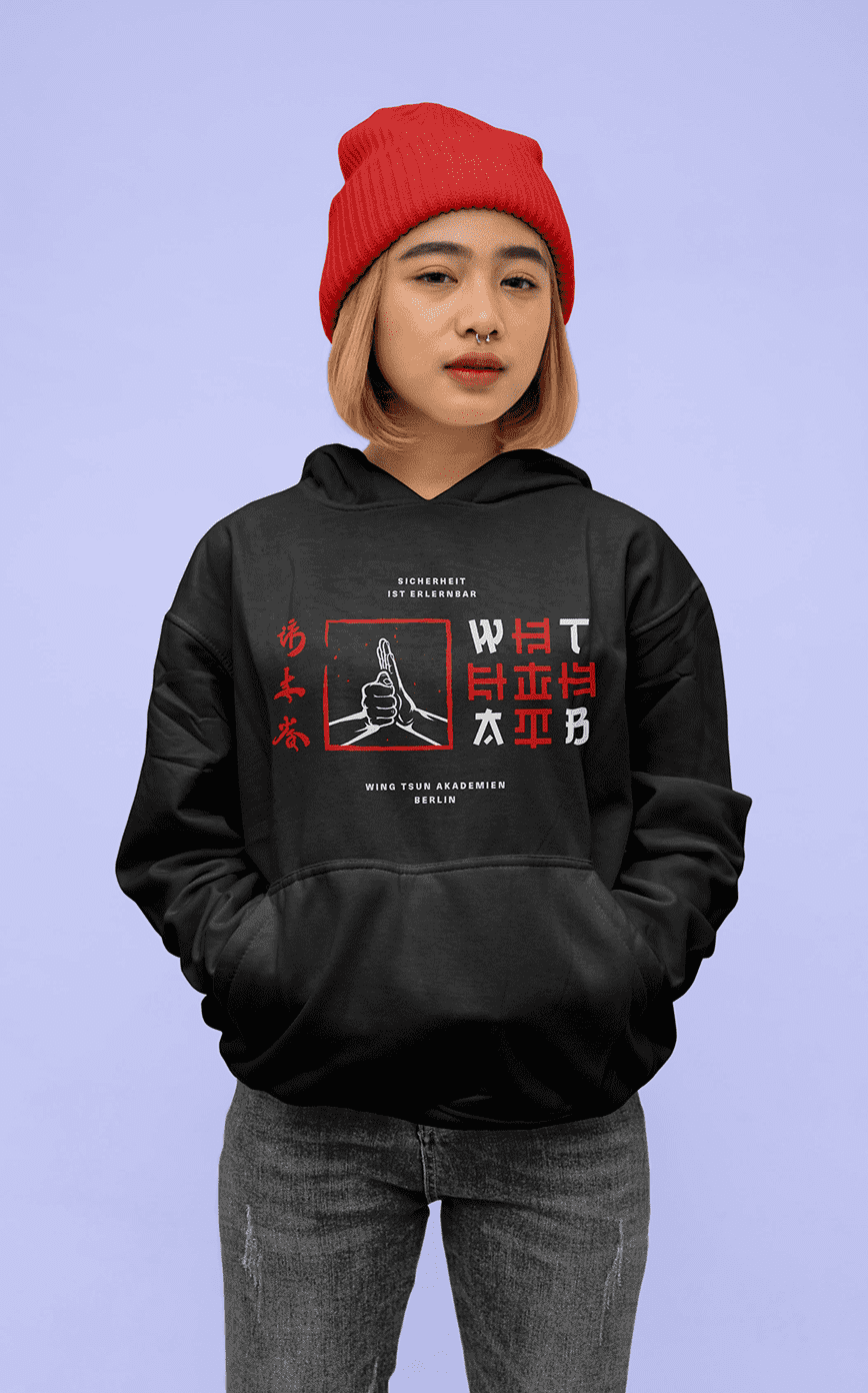
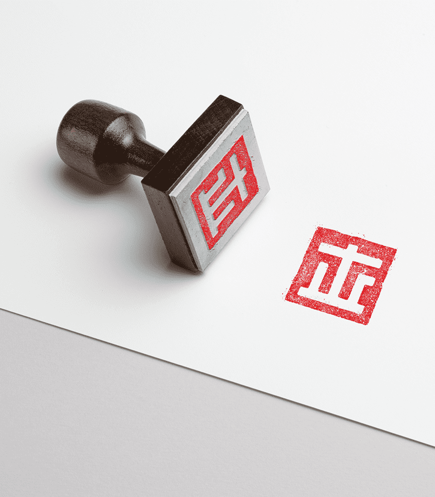
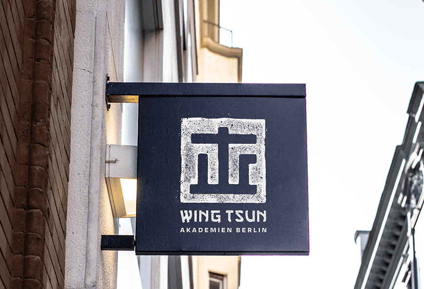
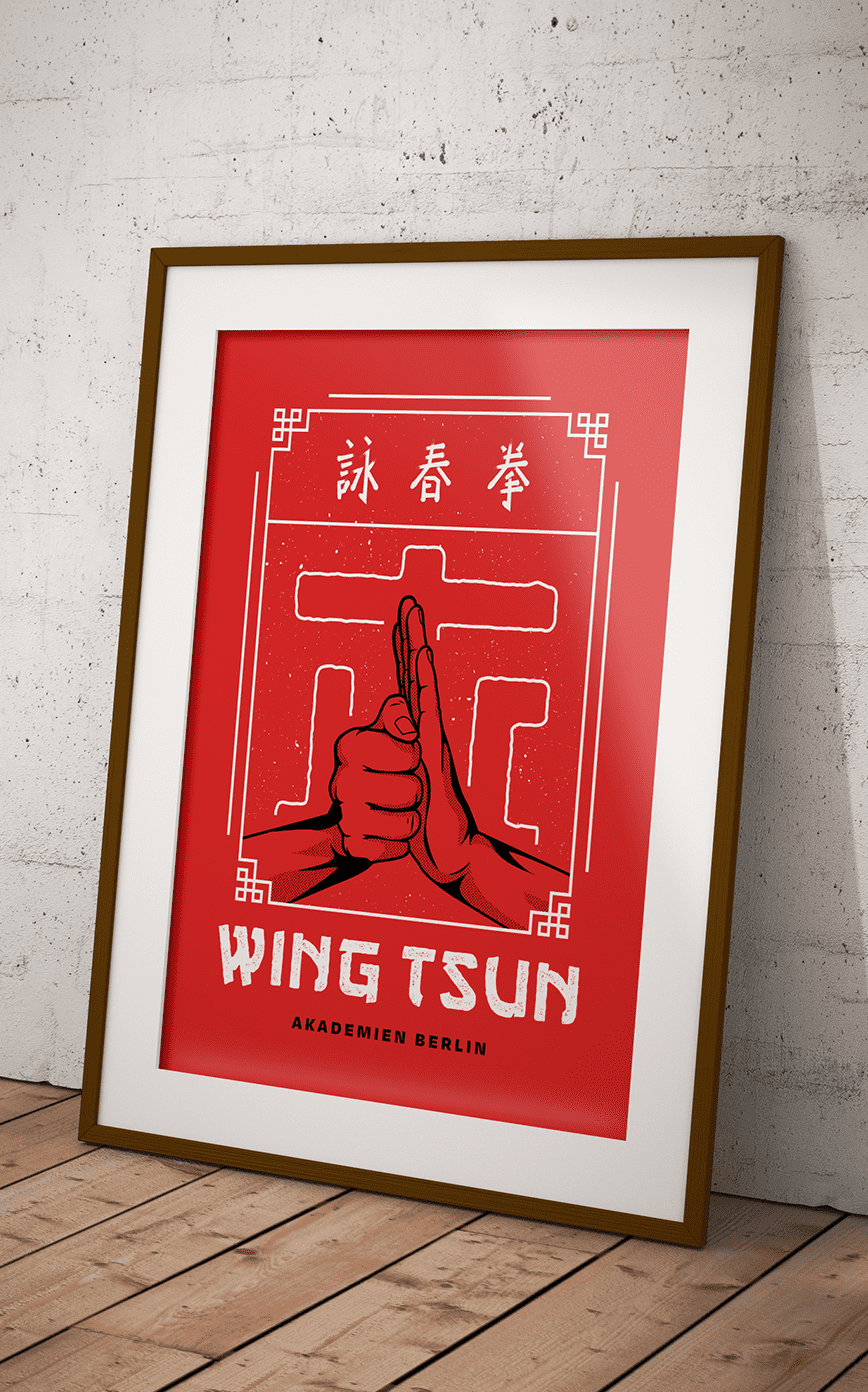
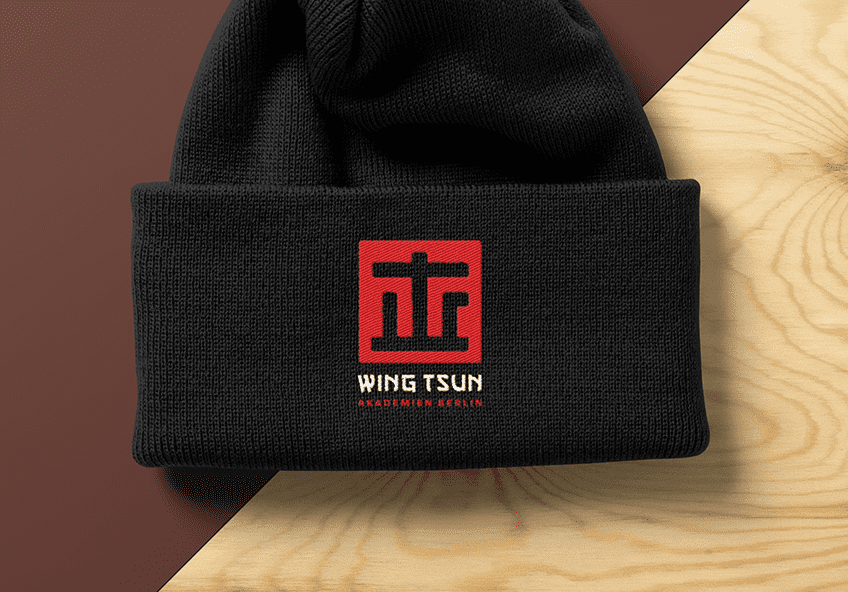
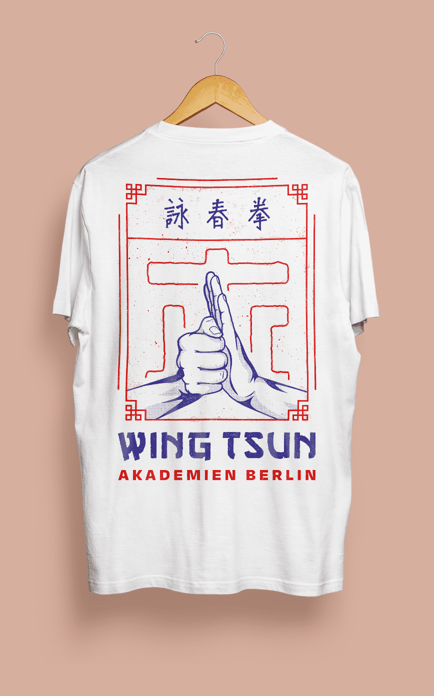
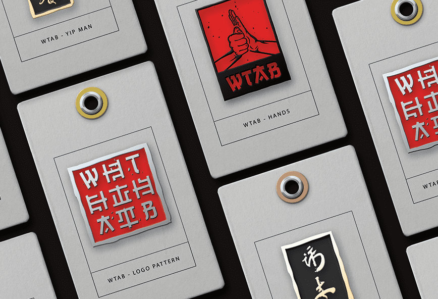
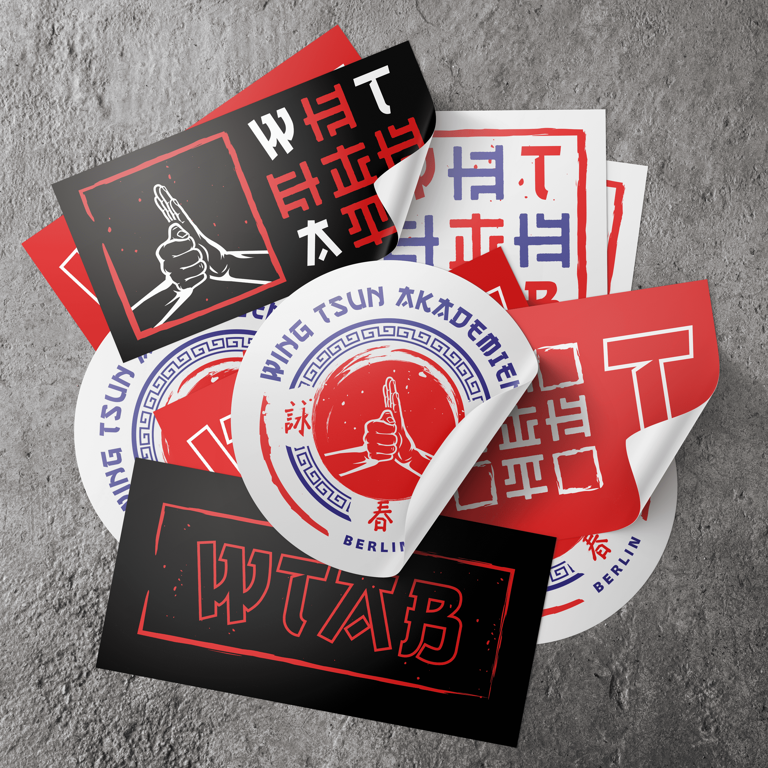
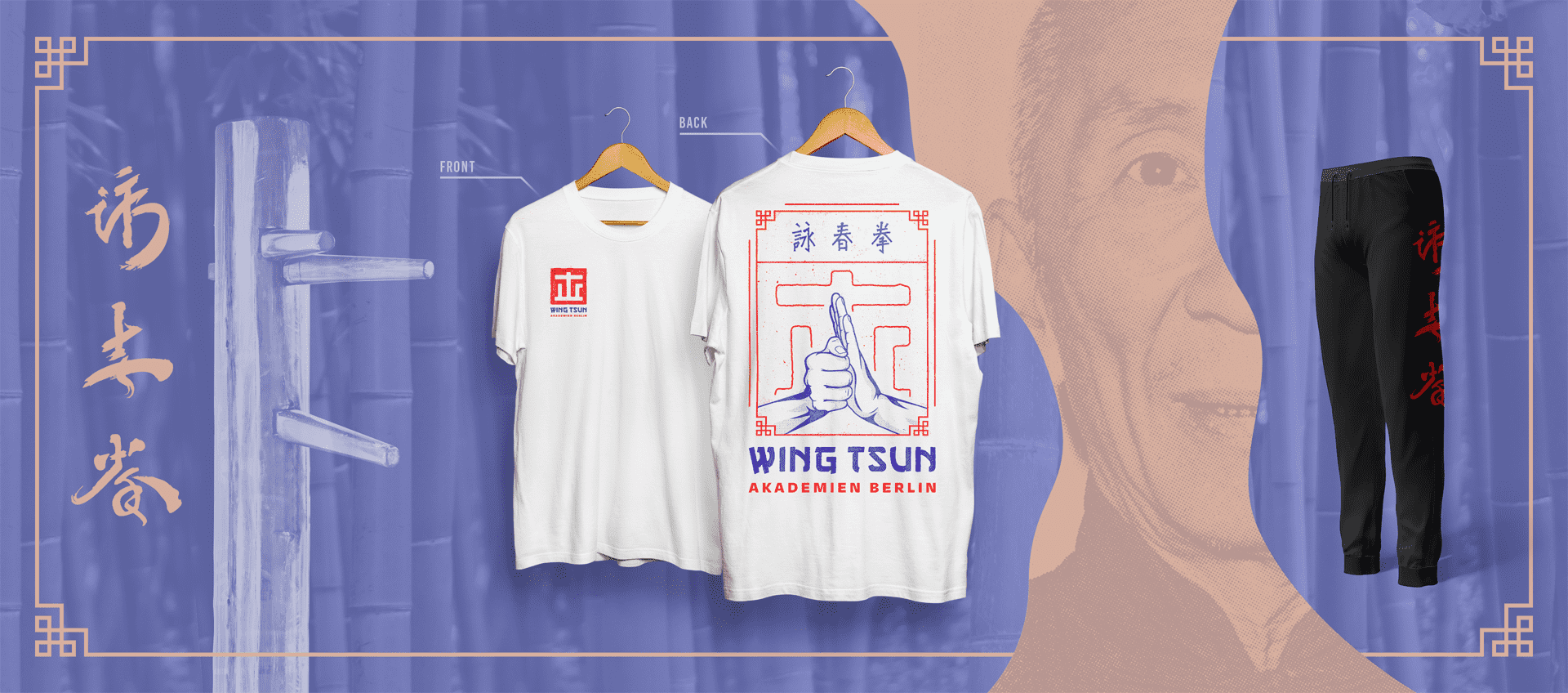
My design solution for WTAB encompassed various elements and deliverables: The logo was carefully designed to serve as the visual representation and face of the academy, embodying the strength, discipline, and grace of martial arts while remaining memorable and distinct. In addition, a comprehensive range of merchandise items was developed, including screen-printed shirts and hoodies (with front, back, and neck prints), training pants, patches, beanies, and tote bags that foster a sense of unity among students and teachers. Each item features the logo and Asian-inspired design elements that showcase the unique visual identity of the academy. In order to boost brand recognition, promotional materials such as a logo stamp, various stickers, and a set of custom metal pins were designed. Furthermore, a captivating window sign and art prints were created to enhance the visual appeal within the martial arts school, creating an engaging and inspiring environment.
This case study is highlighting the importance of strategic design in fostering a strong community and sense of identity.
Gallery
